
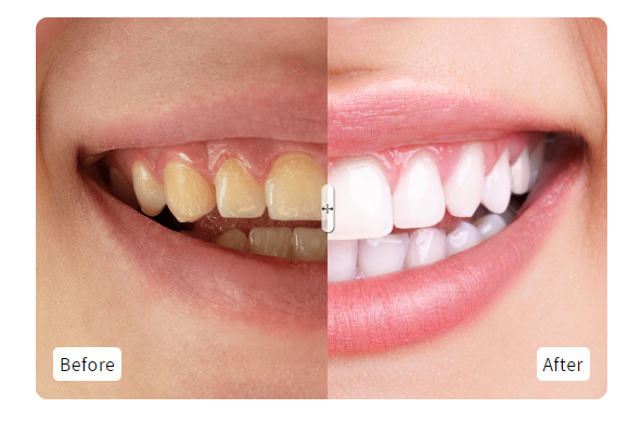
Before and after image slider
A visually interactive image comparison tool that uses a range input to toggle between two overlapping images. It features a draggable vertical divider, customizable text badges, and responsive CSS for desktop and mobile layouts.
- Interactive range-slider input for smooth image transition
- CSS variable-driven positioning for high-performance rendering
- Responsive container with automatic height alignment and object-fit covers
- Built-in 'Before' and 'After' label badges for clear context
- SVG-based custom slider handle for improved user experience navigation
- Showcasing product results like skincare or dental treatments
- Comparing photo editing presets or artistic services
- Displaying home renovation or cleaning service transformations
- Visualizing the difference between two product variations or materials
- Shopify Online Store 2.0
- Most Shopify themes
The code
1<main class="ba_main">2 <div class="container before_after">3 <div class="image-container">4 <div class="before_img">5 <img6 class="image-before slider-image"7 src="https://localdentalclinics.com.au/blogs/1671520930.png"8 alt="color photo"9 >10 <span11 class="before_badge ba_badge"12 style="display: block;"13 >Before</span14 >15 </div>16 <div class="after_img">17 <img18 class="image-after slider-image"19 src="https://beaulieudental.co.uk/wp-content/uploads/2020/11/teeth-whitening-after-1.jpg"20 alt="black and white"21 >22 <span class="after_badge ba_badge" style="display: block;"23 >After</span24 >25 </div>26 </div>27 <input28 type="range"29 min="0"30 max="100"31 value="50"32 aria-label="Percentage of before photo shown"33 class="ba-slider"34 >35 <div class="slider-line" aria-hidden="true"></div>36 <div class="slider-button" aria-hidden="true">37 <svg38 xmlns="http://www.w3.org/2000/svg"39 width="10"40 height="10"41 fill="#fff"42 viewBox="0 0 256 256"43 >44 <rect width="256" height="256" fill="none"></rect>45 <line46 x1="128"47 y1="40"48 x2="128"49 y2="216"50 fill="none"51 stroke="currentColor"52 stroke-linecap="round"53 stroke-linejoin="round"54 stroke-width="16"55 ></line>56 <line57 x1="96"58 y1="128"59 x2="16"60 y2="128"61 fill="none"62 stroke="currentColor"63 stroke-linecap="round"64 stroke-linejoin="round"65 stroke-width="16"66 ></line>67 <polyline class="before_arrow"68 points="48 160 16 128 48 96"69 fill="none"70 stroke="currentColor"71 stroke-linecap="round"72 stroke-linejoin="round"73 stroke-width="16"74 ></polyline>75 <line76 x1="160"77 y1="128"78 x2="240"79 y2="128"80 fill="none"81 stroke="currentColor"82 stroke-linecap="round"83 stroke-linejoin="round"84 stroke-width="16"85 ></line>86 <polyline class="after_arrow"87 points="208 96 240 128 208 160"88 fill="none"89 stroke="currentColor"90 stroke-linecap="round"91 stroke-linejoin="round"92 stroke-width="16"93 ></polyline>94 </svg>95 </div>96 </div>97</main>9899<style>100 .ba_main {101 display: flex;102 place-items: center;103 flex-wrap: wrap;104 gap: 30px;105 padding: 0 5rem;106 max-width: 1200px;107 width: 100%;108 margin: 50px auto;109 }110111 img {112 display: block;113 max-width: 100%;114 }115116 .container {117 display: grid;118 position: relative;119 overflow: hidden;120 border-radius: 1rem;121 --position: 50%;122 width: 50%;123 margin: 0 auto;124 }125126 .image-container {127 max-width: 1200px;128 }129130 .before_badge {131 z-index: 99 !important;132 position: absolute;133 bottom: 15px;134 left: 15px;135 background: #fff;136 padding: 0 5px;137 border-radius: 5px;138 color: #000;139 }140141 .after_badge {142 z-index: 99 !important;143 position: absolute;144 bottom: 15px;145 right: 15px;146 background: #fff;147 padding: 0 5px;148 border-radius: 5px;149 color: #000;150 }151152 .slider-image {153 width: 100%;154 height: 100%;155 object-fit: cover;156 object-position: left;157 max-height: 500px;158 }159160 .image-before {161 position: absolute;162 inset: 0;163 width: var(--position);164 }165166 .ba-slider {167 position: absolute;168 inset: 0;169 cursor: pointer;170 opacity: 0;171 width: 100%;172 height: 100%;173 }174175 .ba-slider:focus-visible ~ .slider-button {176 outline: 5px solid black;177 outline-offset: 3px;178 }179180 .slider-line {181 position: absolute;182 inset: 0;183 width: .2rem;184 height: 100%;185 background-color: #fff;186 left: var(--position);187 transform: translateX(-50%);188 pointer-events: none;189 }190191 .slider-button {192 position: absolute;193 background-color: #ffffffb5 !important;194 color: black;195 padding: .5rem;196 border-radius: 100vw;197 display: grid;198 place-items: center;199 top: 50%;200 left: var(--position);201 transform: translate(-50%, -50%);202 pointer-events: none;203 box-shadow: 1px 1px 1px hsl(0, 50%, 2%, .5);204width: 10px;205height: 40px;206 }207208 @media only screen and (max-width: 768px) {209 .container {210 width: 100%;211 }212 .ba_main {213 padding: 0 20px;214 }215 }216</style>217218<script>219 document.addEventListener("DOMContentLoaded", function () {220 const container = document.querySelector(".before_after");221 const slider = document.querySelector(".ba-slider");222223 slider.addEventListener("input", (e) => {224 container.style.setProperty("--position", `${e.target.value}%`);225 });226 });227</script>
How to install Before and after image slider on your Shopify theme
This snippet belongs in a new section file, or sections/image-banner.liquid, on the homepage, between the hero and your featured collection. Expect the whole job to take about 15–25 minutes.
- 1From your Shopify admin, open Online Store → Themes, click the … button on your live theme and choose Duplicate. Always work on a copy so you can roll back instantly.
- 2On the duplicated theme, click … → Edit code to open the theme code editor.
- 3Open a new section file, or sections/image-banner.liquid in the file tree. If your theme uses different file names, search for the template that renders the area where you want the block to show up.
- 4Click Copy code on this page, then paste the snippet on the homepage, between the hero and your featured collection.
- 5The snippet ships with its own scoped
<style>block, so you do not need to touchbase.cssortheme.css. If you prefer to keep CSS centralised, move the contents of the style tag into your theme stylesheet and delete the inline block. - 6Keep the
<script>tag at the end of the snippet. It only runs once the surrounding markup exists in the DOM, so moving it higher up the file can break the behaviour. - 7Click Save, then hit Preview and check the block on desktop, tablet and mobile widths.
- 8When you are happy with the result, publish the duplicated theme from Online Store → Themes → Actions → Publish.
How to customise it
Every value below lives inside the snippet, so you can adapt Before and after image slider to your brand without touching the rest of the theme.
- Colours — the snippet uses
#fff,#000. Replace those values inside the style block with your brand palette, keeping at least a 4.5:1 contrast ratio between text and background so the block stays accessible. - Corners —
border-radius: 1remcontrols the roundness. Set it to 0 for a sharper editorial look, or increase it for a softer, app-like feel. - Images — replace the placeholder image URLs with your own assets. Upload them under Content → Files in Shopify admin and use the generated CDN URL, or reference a theme asset with
{{ 'my-image.png' | asset_url }}. - Copy — rewrite the hard-coded text (for example “Before”) in your own brand voice, and translate it if you sell in more than one language.
- Responsive behaviour — the
@mediaquery defines the mobile breakpoint. Adjust the pixel value if your theme uses a different breakpoint scale.
Common mistakes to avoid
These are the issues merchants run into most often when installing a snippet like this one.
- Editing the live theme directly. Duplicate it first — a single unbalanced Liquid tag can take a storefront down mid-campaign.
- Pasting the code into the wrong file. Dropped into
layout/theme.liquidinstead ofa, this block will render on every page of the store, including ones where it makes no sense. - Renaming the CSS classes in the markup but not in the style block, or vice versa. The class names have to match exactly or the styling silently disappears.
- Adding the snippet twice on the same page. The script targets its selector, so two copies can conflict or double-fire.
- Leaving the demo images in place. They are hosted on third-party domains, can disappear at any time and slow the page down. Re-upload them to Shopify Files before going live.
- Publishing without testing on a real phone. Most Shopify traffic is mobile, and layout problems almost always surface there first.
Performance notes
What this block costs you in load time, and how to keep that cost at zero.
- The CSS is inline and scoped to this block, so it adds no extra network request. At a few kilobytes it has no measurable effect on your Lighthouse score.
- The JavaScript is vanilla — no jQuery, no external library, no additional request. Keep it after the markup so it never blocks rendering.
- Add
loading="lazy"plus explicit width and height attributes to every image in the snippet. That prevents Cumulative Layout Shift, which is a Core Web Vitals ranking factor. - Third-party image URLs bypass the Shopify CDN and add extra DNS lookups. Self-hosting those assets usually saves 100–300ms on first paint.
- Run PageSpeed Insights before and after you add the block so you have a concrete number rather than a guess.
SEO & accessibility
How to add this block without damaging your on-page structure or your rich results.
- Nothing in this snippet should replace your page
<h1>. Keep product and page headings intact and use<h2>or<h3>for the block's own heading so the document outline stays clean. - Write a descriptive alt attribute for every image. Empty or generic alt text is one of the most common accessibility and SEO issues on Shopify stores.
- If the block shows review or rating content, keep it consistent with the structured data your review app already outputs. Duplicating or contradicting rating markup can cost you the rich result entirely.
- The block does not create a new URL, so there is no canonical or indexing change to make. It improves on-page engagement signals rather than crawlability.
Before and after image slider — questions merchants ask
Will this snippet work with my theme?
It is built with standard Liquid, HTML and CSS, so it works with Dawn and virtually every Online Store 2.0 theme, as well as most vintage themes. The only thing that changes between themes is the file you paste it into — if yours has no a, look for the equivalent template that renders the same area.
Do I need an app to use it?
No. This is theme code you own outright: no monthly fee, no third-party script tag, and no app that can break your storefront the next time it updates.
How long does it take to add “Before and after image slider” to a store?
Most merchants have it live in under fifteen minutes — duplicate the theme, paste the code, adjust the colours and copy, preview on mobile, publish.
The block appears but nothing happens. What is wrong?
That is almost always a script-order problem. Check that the script tag is still at the bottom of the snippet and that the markup was not pasted inside another script or a Liquid comment block. Open your browser console and look for an error naming the snippet's selector.
The styling looks broken after pasting. How do I fix it?
Confirm you copied the whole snippet including the closing style tag, then check whether one of your theme's own CSS rules is overriding it. If a theme rule wins, increase the specificity of the snippet's selector rather than scattering !important through the file.
Will it slow my store down?
Not meaningfully. It is inline markup with scoped CSS and at most a few lines of vanilla JavaScript — no external libraries, no extra HTTP request. Optimising your product images will always have a far bigger impact on load time.
Can I use it on a client store or a commercial project?
Yes. Every snippet in the MCO Hub library is free to copy, modify and ship on any store, including client work. Attribution is appreciated but not required.
Related snippets



Keep exploring
Guides