
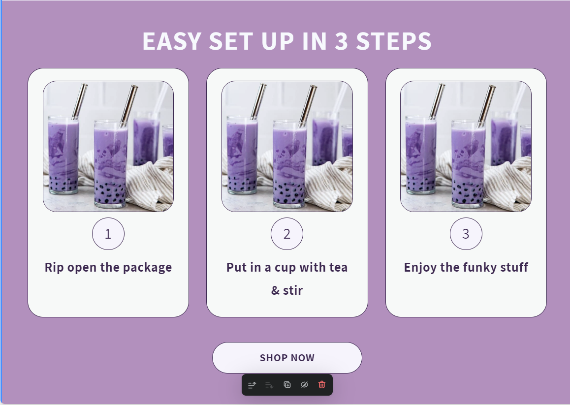
3 Steps section
A decorative horizontal instruction section that breaks down processes into three distinct cards. It uses Swiper.js for a mobile-responsive carousel and features custom-styled numbered badges to guide users through a setup or usage flow.
- Mobile-responsive Swiper carousel integration
- Custom numbered step indicators (badges)
- Variable-based CSS color and typography control
- Responsive padding and font scaling for desktop/mobile views
- Image-focused step design with aspect-ratio protection
- Displaying 'How to use' instructions for supplement or food products
- Explaining simple assembly processes for furniture or hardware
- Outlining service booking steps for a cleaner store layout
- Visually simplifying complex shipping or return policies into steps
- Most Shopify themes
- Shopify Online Store 2.0
The code
1<section class='shopify-section section' id='shopify-section-template--16878979842297__16256d98-513b-4da7-9c8b-9bbb7cab843f'>2 <style data-shopify=''>3 .section-template--16878979842297__16256d98-513b-4da7-9c8b-9bbb7cab843f-padding {4 max-width: 120rem;5 margin: 0 auto;6 padding: 0 1.5rem;7 padding-top: 36px;8 padding-bottom: 75px;9 }1011 @media screen and (min-width: 750px) {12 .section-template--16878979842297__16256d98-513b-4da7-9c8b-9bbb7cab843f-padding {13 padding: 0 5rem;14 padding-top: 48px;15 padding-bottom: 100px;16 }17 }18 </style>19 <style>20 .easy-setup {21 color: var(--text-color);22 }23 .easy-setup div {24 box-sizing: border-box;25 }26 .easy-setup p {27 margin-top: 0;28 margin-bottom: 0;29 }30 @media screen and (min-width: 750px) {31 .easy-setup .swiper-arrow-icon-wrapper {32 display: none;33 }34 }35 .swiper-arrow-icon-wrapper {36 display: flex;37 gap: 1rem;38 }39 @media screen and (min-width: 750px) {40 .swiper-arrow-icon-wrapper {41 gap: 1.5rem;42 }43 }44 .swiper-arrow-icon {45 color: var(--text-color);46 display: inline-block;47 width: 70px;48 height: 70px;49 position: unset;50 margin-top: unset;51 margin-bottom: 43px;52 }53 .swiper-arrow-icon--left {54 transform: rotate(180deg);55 }56 @media screen and (min-width: 750px) {57 .swiper-arrow-icon {58 width: 97px;59 height: 97px;60 margin-bottom: 60px;61 }62 }63 .easy-setup-title {64 font-size: calc(var(--title-font-size) * 0.5);65 font-weight: 800;66 line-height: 107%;67 letter-spacing: 0.04em;68 margin-bottom: 1rem;69 color: var(--title-color);70 }71 @media screen and (min-width: 750px) {72 .easy-setup-title {73 font-size: calc(var(--title-font-size) * 0.75);74 text-align: center;75 margin-bottom: 2rem;76 }77 }78 @media screen and (min-width: 750px) {79 .easy-setup-title {80 font-size: var(--title-font-size);81 margin-bottom: 2.5rem;82 }83 }84 /* .ss-custom-card will be reused on other sections */85 .ss-custom-card {86 border: 1px solid var(--text-color);87 border-radius: 29px;88 background: var(--card-background-color, #fef9f3);89 padding: 20px;90 height: auto;91 width: 100%;92 }93 @media screen and (min-width: 750px) {94 .ss-custom-card {95 padding: 23px 27px;96 }97 }98 .ss-custom-card__title {99 font-weight: 800;100 font-size: var(--product-card-title-font-size, 24px);101 margin-bottom: 5px;102 text-align: center;103 }104 .ss-custom-card__desc {105 font-weight: 500;106 font-size: var(--product-card-description-font-size, 20px);107 margin-bottom: 13px;108 }109 .ss-custom-card__link {110 border: 1px solid var(--text-color);111 color: var(--text-color);112 font-weight: 800;113 background: var(--link-background-color, #fbf4fe);114 border-radius: 45px;115 display: flex;116 align-items: center;117 justify-content: center;118 height: 50px;119 width: 100%;120 text-decoration: none;121 }122 @media screen and (min-width: 750px) {123 .ss-custom-card__link {124 height: 60px;125 }126 }127 .ss-custom-card__image {128 width: 100%;129 object-fit: cover;130 aspect-ratio: 1/1;131 border: 1px solid var(--text-color);132 border-radius: 26px;133 }134 .ss-custom-card__index {135 border: 1px solid var(--text-color);136 border-radius: 50%;137 width: 60px;138 height: 60px;139 display: flex;140 align-items: center;141 justify-content: center;142 margin: 1rem auto;143 background: var(--second-card-background-color, #f9f9f9);144 font-weight: 500;145 font-size: 28px;146 }147 </style>148 <style>149 .ss-custom-cta {150 display: flex;151 flex-direction: column;152 align-items: center;153 justify-content: center;154 padding: 1rem;155 width: 277px;156 margin: 0 auto;157 background: var(--second-card-background-color);158 border-radius: 45px;159 font-size: 20px;160 font-weight: 800;161 border: 1px solid var(--text-color);162 color: var(--text-color);163 margin-top: 45px;164 text-decoration: none;165 }166 </style>167 <div class='easy-setup' id='easy-setup' style='168 background-color:#bb8fc1;169 --title-font-size: 48px;170 --title-color: #ffffff;171 --product-card-title-font-size: 24px;172 --text-color:#432a54;173 --card-background-color: #fef9f3;174 --second-card-background-color: #fbf4fe;175 overflow: hidden;176 '>177 <div class='page-width section-template--16878979842297__16256d98-513b-4da7-9c8b-9bbb7cab843f-padding'>178 <div class='easy-setup-title'>179 EASY SET UP IN 3 STEPS180 </div>181 <div class='swiper swiper-template--16878979842297__16256d98-513b-4da7-9c8b-9bbb7cab843f' style='overflow:visible'>182 <div class='swiper-arrow-icon-wrapper'>183 <svg class='swiper-button-prev swiper-arrow-icon swiper-arrow-icon--left' fill='none' viewbox='0 0 97 97' xmlns='http://www.w3.org/2000/svg'>184 <circle cx='48.6602' cy='48.75' fill='#fef9f3' r='47.5' stroke='currentColor'>185 </circle>186 <path d='M72.9825 49.8107C73.5683 49.2249 73.5683 48.2751 72.9825 47.6893L63.4366 38.1434C62.8508 37.5576 61.9011 37.5576 61.3153 38.1434C60.7295 38.7292 60.7295 39.6789 61.3153 40.2647L69.8006 48.75L61.3153 57.2353C60.7295 57.8211 60.7295 58.7708 61.3153 59.3566C61.9011 59.9424 62.8508 59.9424 63.4366 59.3566L72.9825 49.8107ZM29.9219 50.25H71.9219V47.25H29.9219V50.25Z' fill='currentColor'>187 </path>188 </svg>189 <svg class='swiper-button-next swiper-arrow-icon swiper-arrow-icon--right' fill='none' viewbox='0 0 97 97' xmlns='http://www.w3.org/2000/svg'>190 <circle cx='48.6602' cy='48.75' fill='#fef9f3' r='47.5' stroke='currentColor'>191 </circle>192 <path d='M72.9825 49.8107C73.5683 49.2249 73.5683 48.2751 72.9825 47.6893L63.4366 38.1434C62.8508 37.5576 61.9011 37.5576 61.3153 38.1434C60.7295 38.7292 60.7295 39.6789 61.3153 40.2647L69.8006 48.75L61.3153 57.2353C60.7295 57.8211 60.7295 58.7708 61.3153 59.3566C61.9011 59.9424 62.8508 59.9424 63.4366 59.3566L72.9825 49.8107ZM29.9219 50.25H71.9219V47.25H29.9219V50.25Z' fill='currentColor'>193 </path>194 </svg>195 </div>196 <div class='swiper-wrapper'>197 <div class='swiper-slide ss-custom-card'>198 <img alt='' class='ss-custom-card__image' src='//section.store/cdn/shop/files/image_6_400x.png?v=1677651130' srcset='199 //section.store/cdn/shop/files/image_6_400x.png?v=1677651130 400w,200 //section.store/cdn/shop/files/image_6_600x.png?v=1677651130 800w,201 //section.store/cdn/shop/files/image_6_800x.png?v=1677651130 1200w,202 //section.store/cdn/shop/files/image_6_1000x.png?v=1677651130 1600w,203 //section.store/cdn/shop/files/image_6.png?v=1677651130 2000w204 '/>205 <div class='ss-custom-card__index'>206 1207 </div>208 <div class='ss-custom-card__title'>209 <p>210 Rip open the package211 </p>212 </div>213 </div>214 <div class='swiper-slide ss-custom-card'>215 <img alt='' class='ss-custom-card__image' src='//section.store/cdn/shop/files/image_6_400x.png?v=1677651130' srcset='216 //section.store/cdn/shop/files/image_6_400x.png?v=1677651130 400w,217 //section.store/cdn/shop/files/image_6_600x.png?v=1677651130 800w,218 //section.store/cdn/shop/files/image_6_800x.png?v=1677651130 1200w,219 //section.store/cdn/shop/files/image_6_1000x.png?v=1677651130 1600w,220 //section.store/cdn/shop/files/image_6.png?v=1677651130 2000w221 '/>222 <div class='ss-custom-card__index'>223 2224 </div>225 <div class='ss-custom-card__title'>226 <p>227 Put in a cup with tea & stir228 </p>229 </div>230 </div>231 <div class='swiper-slide ss-custom-card'>232 <img alt='' class='ss-custom-card__image' src='//section.store/cdn/shop/files/image_6_400x.png?v=1677651130' srcset='233 //section.store/cdn/shop/files/image_6_400x.png?v=1677651130 400w,234 //section.store/cdn/shop/files/image_6_600x.png?v=1677651130 800w,235 //section.store/cdn/shop/files/image_6_800x.png?v=1677651130 1200w,236 //section.store/cdn/shop/files/image_6_1000x.png?v=1677651130 1600w,237 //section.store/cdn/shop/files/image_6.png?v=1677651130 2000w238 '/>239 <div class='ss-custom-card__index'>240 3241 </div>242 <div class='ss-custom-card__title'>243 <p>244 Enjoy the funky stuff245 </p>246 </div>247 </div>248 </div>249 </div>250 <a class='ss-custom-cta' href=''>251 SHOP NOW252 </a>253 </div>254 </div>255 <script>256 // load the swiper css and js only once:257 (function () {258 const cssId = 'swiper-css';259 let existingLink = document.getElementById(cssId);260 if (!existingLink) {261 let link = document.createElement('link');262 link.href = 'https://cdn.jsdelivr.net/npm/swiper@9/swiper-bundle.min.css';263 link.rel = 'stylesheet';264 link.id = cssId;265 let head = document.getElementsByTagName('head')[0];266 head.appendChild(link);267 }268 const jsId = 'swiper-js';269 let existingScript = document.getElementById(jsId);270 if (!existingScript) {271 let script = document.createElement('script');272 script.src = 'https://cdn.jsdelivr.net/npm/swiper@9/swiper-bundle.min.js';273 script.id = jsId;274 script.defer = true;275 // fire a custom event when the script is loaded:276 script.onload = function () {277 let event = new Event('swiper:loaded');278 document.dispatchEvent(event);279 };280 let head = document.getElementsByTagName('head')[0];281 head.appendChild(script);282 }283284 function loadSwiper() {285 try {286 new Swiper('.swiper-template--16878979842297__16256d98-513b-4da7-9c8b-9bbb7cab843f', {287 slidesPerView: 1.2,288 spaceBetween: 22,289 navigation: {290 nextEl: '.swiper-arrow-icon--right',291 prevEl: '.swiper-arrow-icon--left',292 },293 breakpoints: {294 750: {295 slidesPerView: 3,296 spaceBetween: 32,297 },298 //1440: {299 // slidesPerView: 3.8,300 // spaceBetween: 32,301 //},302 },303 });304 } catch (e) {305 console.log('Swiper not loaded');306 console.log(e);307 }308 }309 document.addEventListener('swiper:loaded', loadSwiper);310 if (window.Shopify && Shopify.designMode) {311 document.addEventListener('shopify:section:load', loadSwiper);312 }313 })();314 </script>315</section>316<style>317 .ss-custom-cta {318 display: flex;319 flex-direction: column;320 align-items: center;321 justify-content: center;322 padding: 1rem;323 width: 277px;324 margin: 0 auto;325 background: var(--second-card-background-color);326 border-radius: 45px;327 font-size: 20px;328 font-weight: 800;329 border: 1px solid var(--text-color);330 color: var(--text-color);331 margin-top: 45px;332 text-decoration: none;333 }334</style><style>.section-template--16878979842297__16256d98-513b-4da7-9c8b-9bbb7cab843f-padding {335 max-width: 120rem;336 margin: 0 auto;337 padding: 0 1.5rem;338 padding-top: 36px;339 padding-bottom: 75px;340 }341342 @media screen and (min-width: 750px) {343 .section-template--16878979842297__16256d98-513b-4da7-9c8b-9bbb7cab843f-padding {344 padding: 0 5rem;345 padding-top: 48px;346 padding-bottom: 100px;347 }348 }</style><style>349 .best-seller {350 color: var(--text-color);351 }352 .best-seller div {353 box-sizing: border-box;354 }355 .best-seller p {356 margin-top: 0;357 margin-bottom: 0;358 line-height: 1.07;359 }360 .swiper-arrow-icon-wrapper {361 display: flex;362 gap: 1rem;363 }364 @media screen and (min-width: 750px) {365 .swiper-arrow-icon-wrapper {366 gap: 1.5rem;367 }368 }369 .swiper-arrow-icon {370 color: var(--text-color);371 display: inline-block;372 width: 70px;373 height: 70px;374 position: unset;375 margin-top: unset;376 margin-bottom: 43px;377 }378 .swiper-arrow-icon--left {379 transform: rotate(180deg);380 }381 @media screen and (min-width: 750px) {382 .swiper-arrow-icon {383 width: 97px;384 height: 97px;385 margin-bottom: 60px;386 }387 }388 .best-seller-title {389 font-size: calc(var(--title-font-size) * 0.5);390 font-weight: 800;391 line-height: 107%;392 letter-spacing: 0.04em;393 margin-bottom: 1rem;394 }395 @media screen and (min-width: 750px) {396 .best-seller-title {397 font-size: calc(var(--title-font-size) * 0.75);398 }399 }400 @media screen and (min-width: 750px) {401 .best-seller-title {402 font-size: var(--title-font-size);403 margin-bottom: 2rem;404 }405 }406 .best-seller-card {407 border: 1px solid var(--text-color);408 border-radius: 29px;409 background: var(--card-background-color, #fef9f3);410 padding: 20px;411 height: auto;412 }413 @media screen and (min-width: 750px) {414 .best-seller-card {415 padding: 23px 27px;416 }417 }418 .best-seller-card__title {419 font-weight: 800;420 font-size: var(--product-card-title-font-size, 24px);421 margin-bottom: 5px;422 }423 .best-seller-card__desc {424 font-weight: 500;425 font-size: var(--product-card-description-font-size, 20px);426 margin-bottom: 13px;427 }428 .best-seller-card__link {429 border: 1px solid var(--text-color);430 color: var(--text-color);431 font-weight: 800;432 background: var(--link-background-color, #fbf4fe);433 border-radius: 45px;434 display: flex;435 align-items: center;436 justify-content: center;437 height: 50px;438 width: 100%;439 text-decoration: none;440 font-size: 20px;441 }442 @media screen and (min-width: 750px) {443 .best-seller-card__link {444 height: 60px;445 }446 }447 .best-seller-card__image {448 width: 100%;449 object-fit: contain;450 }451</style><style>452453 .rating-item svg {454 width:16px;455 height:16px;456 border:none;457 margin-right:0px;458 line-height: 1.6;459 fill: var(--text-color);460 }461462 .customers-reviews {463 color: var(--text-color);464 text-align: center;465 }466 .customers-reviews div {467 box-sizing: border-box;468 }469 .customers-reviews p {470 margin-top: 0;471 margin-bottom: 0;472 }473 @media screen and (min-width: 750px) {474 .customers-reviews .swiper-arrow-icon-wrapper {475 display: none;476 }477 }478 .swiper-arrow-icon-wrapper {479 display: flex;480 gap: 1rem;481 }482 @media screen and (min-width: 750px) {483 .swiper-arrow-icon-wrapper {484 gap: 1.5rem;485 }486 }487 .swiper-arrow-icon {488 color: var(--text-color);489 display: inline-block;490 width: 70px;491 height: 70px;492 position: unset;493 margin-top: unset;494 margin-bottom: 43px;495 }496 .swiper-arrow-icon--left {497 transform: rotate(180deg);498 }499 @media screen and (min-width: 750px) {500 .swiper-arrow-icon {501 width: 97px;502 height: 97px;503 margin-bottom: 60px;504 }505 }506 .customers-reviews-title {507 font-size: calc(var(--title-font-size) * 0.5);508 font-weight: 800;509 line-height: 107%;510 letter-spacing: 0.04em;511 margin-bottom: 1rem;512 color: var(--title-color);513 }514 @media screen and (min-width: 750px) {515 .customers-reviews-title {516 font-size: calc(var(--title-font-size) * 0.75);517 margin-bottom: 60px;518 text-align: center;519 }520 }521 @media screen and (min-width: 750px) {522 .customers-reviews-title {523 font-size: var(--title-font-size);524 }525 }526 /* .ss-custom-card will be reused on other sections */527 .ss-custom-card {528 border: 1px solid var(--text-color);529 border-radius: 29px;530 background: var(--card-background-color, #fef9f3);531 padding: 20px;532 height: auto;533 width: 100%;534 }535 @media screen and (min-width: 750px) {536 .ss-custom-card {537 padding: 23px 27px;538 }539 }540 .ss-custom-card__title {541 font-weight: 800;542 font-size: var(--product-card-title-font-size, 24px);543 margin-bottom: 5px;544 text-align: center;545 }546 .ss-custom-card__desc {547 font-weight: 500;548 font-size: var(--product-card-description-font-size, 20px);549 margin-bottom: 13px;550 }551 .ss-custom-card__rating {552 display: flex;553 align-items: center;554 justify-content: center;555 gap: 5px;556 margin-bottom: 13px;557 }558 .ss-custom-card__author {559 font-size: 24px;560 font-weight: 800;561 }562 .ss-custom-card__link {563 border: 1px solid var(--text-color);564 color: var(--text-color);565 font-weight: 800;566 background: var(--link-background-color, #fbf4fe);567 border-radius: 45px;568 display: flex;569 align-items: center;570 justify-content: center;571 height: 50px;572 width: 100%;573 text-decoration: none;574 }575 @media screen and (min-width: 750px) {576 .ss-custom-card__link {577 height: 60px;578 }579 }580 .ss-custom-card__image {581 width: 100%;582 object-fit: cover;583 aspect-ratio: 1/1;584 border: 1px solid var(--text-color);585 border-radius: 26px;586 }587 .ss-custom-card__index {588 border: 1px solid var(--text-color);589 border-radius: 50%;590 width: 60px;591 height: 60px;592 display: flex;593 align-items: center;594 justify-content: center;595 margin: 1rem auto;596 background: var(--second-card-background-color, #f9f9f9);597 font-weight: 500;598 font-size: 28px;599 }600</style><style>601 .easy-setup {602 color: var(--text-color);603 }604 .easy-setup div {605 box-sizing: border-box;606 }607 .easy-setup p {608 margin-top: 0;609 margin-bottom: 0;610 }611 @media screen and (min-width: 750px) {612 .easy-setup .swiper-arrow-icon-wrapper {613 display: none;614 }615 }616 .swiper-arrow-icon-wrapper {617 display: flex;618 gap: 1rem;619 }620 @media screen and (min-width: 750px) {621 .swiper-arrow-icon-wrapper {622 gap: 1.5rem;623 }624 }625 .swiper-arrow-icon {626 color: var(--text-color);627 display: inline-block;628 width: 70px;629 height: 70px;630 position: unset;631 margin-top: unset;632 margin-bottom: 43px;633 }634 .swiper-arrow-icon--left {635 transform: rotate(180deg);636 }637 @media screen and (min-width: 750px) {638 .swiper-arrow-icon {639 width: 97px;640 height: 97px;641 margin-bottom: 60px;642 }643 }644 .easy-setup-title {645 font-size: calc(var(--title-font-size) * 0.5);646 font-weight: 800;647 line-height: 107%;648 letter-spacing: 0.04em;649 margin-bottom: 1rem;650 color: var(--title-color);651 }652 @media screen and (min-width: 750px) {653 .easy-setup-title {654 font-size: calc(var(--title-font-size) * 0.75);655 text-align: center;656 margin-bottom: 2rem;657 }658 }659 @media screen and (min-width: 750px) {660 .easy-setup-title {661 font-size: var(--title-font-size);662 margin-bottom: 2.5rem;663 }664 }665 /* .ss-custom-card will be reused on other sections */666 .ss-custom-card {667 border: 1px solid var(--text-color);668 border-radius: 29px;669 background: var(--card-background-color, #fef9f3);670 padding: 20px;671 height: auto;672 width: 100%;673 }674 @media screen and (min-width: 750px) {675 .ss-custom-card {676 padding: 23px 27px;677 }678 }679 .ss-custom-card__title {680 font-weight: 800;681 font-size: var(--product-card-title-font-size, 24px);682 margin-bottom: 5px;683 text-align: center;684 }685 .ss-custom-card__desc {686 font-weight: 500;687 font-size: var(--product-card-description-font-size, 20px);688 margin-bottom: 13px;689 }690 .ss-custom-card__link {691 border: 1px solid var(--text-color);692 color: var(--text-color);693 font-weight: 800;694 background: var(--link-background-color, #fbf4fe);695 border-radius: 45px;696 display: flex;697 align-items: center;698 justify-content: center;699 height: 50px;700 width: 100%;701 text-decoration: none;702 }703 @media screen and (min-width: 750px) {704 .ss-custom-card__link {705 height: 60px;706 }707 }708 .ss-custom-card__image {709 width: 100%;710 object-fit: cover;711 aspect-ratio: 1/1;712 border: 1px solid var(--text-color);713 border-radius: 26px;714 }715 .ss-custom-card__index {716 border: 1px solid var(--text-color);717 border-radius: 50%;718 width: 60px;719 height: 60px;720 display: flex;721 align-items: center;722 justify-content: center;723 margin: 1rem auto;724 background: var(--second-card-background-color, #f9f9f9);725 font-weight: 500;726 font-size: 28px;727 }728</style>
How to install 3 Steps section on your Shopify theme
This snippet belongs in sections/main-product.liquid (or any section where you want it to appear), in the block of your template where it makes the most contextual sense. Expect the whole job to take about 15–25 minutes.
- 1From your Shopify admin, open Online Store → Themes, click the … button on your live theme and choose Duplicate. Always work on a copy so you can roll back instantly.
- 2On the duplicated theme, click … → Edit code to open the theme code editor.
- 3Open sections/main-product.liquid (or any section where you want it to appear) in the file tree. If your theme uses different file names, search for the template that renders the area where you want the block to show up.
- 4Click Copy code on this page, then paste the snippet in the block of your template where it makes the most contextual sense.
- 5The snippet ships with its own scoped
<style>block, so you do not need to touchbase.cssortheme.css. If you prefer to keep CSS centralised, move the contents of the style tag into your theme stylesheet and delete the inline block. - 6Keep the
<script>tag at the end of the snippet. It only runs once the surrounding markup exists in the DOM, so moving it higher up the file can break the behaviour. - 7Click Save, then hit Preview and check the block on desktop, tablet and mobile widths.
- 8When you are happy with the result, publish the duplicated theme from Online Store → Themes → Actions → Publish.
How to customise it
Every value below lives inside the snippet, so you can adapt 3 Steps section to your brand without touching the rest of the theme.
- Colours — the snippet uses
#fef9f3,#fbf4fe,#f9f9f9,#bb8fc1. Replace those values inside the style block with your brand palette, keeping at least a 4.5:1 contrast ratio between text and background so the block stays accessible. - Sizing — adjust the font-size values (calc(var(--title-font-size) * 0.5), calc(var(--title-font-size) * 0.75), var(--title-font-size)) and the padding so the block carries the same visual weight as the elements around it.
- Corners —
border-radius: 29pxcontrols the roundness. Set it to 0 for a sharper editorial look, or increase it for a softer, app-like feel. - Images — replace the placeholder image URLs with your own assets. Upload them under Content → Files in Shopify admin and use the generated CDN URL, or reference a theme asset with
{{ 'my-image.png' | asset_url }}. - Responsive behaviour — the
@mediaquery defines the mobile breakpoint. Adjust the pixel value if your theme uses a different breakpoint scale.
Common mistakes to avoid
These are the issues merchants run into most often when installing a snippet like this one.
- Editing the live theme directly. Duplicate it first — a single unbalanced Liquid tag can take a storefront down mid-campaign.
- Pasting the code into the wrong file. Dropped into
layout/theme.liquidinstead ofsections/main-product.liquid, this block will render on every page of the store, including ones where it makes no sense. - Renaming the CSS classes in the markup but not in the style block, or vice versa. The class names have to match exactly or the styling silently disappears.
- Adding the snippet twice on the same page. The script targets its selector, so two copies can conflict or double-fire.
- Publishing without testing on a real phone. Most Shopify traffic is mobile, and layout problems almost always surface there first.
Performance notes
What this block costs you in load time, and how to keep that cost at zero.
- The CSS is inline and scoped to this block, so it adds no extra network request. At a few kilobytes it has no measurable effect on your Lighthouse score.
- The JavaScript is vanilla — no jQuery, no external library, no additional request. Keep it after the markup so it never blocks rendering.
- Add
loading="lazy"plus explicit width and height attributes to every image in the snippet. That prevents Cumulative Layout Shift, which is a Core Web Vitals ranking factor. - Run PageSpeed Insights before and after you add the block so you have a concrete number rather than a guess.
SEO & accessibility
How to add this block without damaging your on-page structure or your rich results.
- Nothing in this snippet should replace your page
<h1>. Keep product and page headings intact and use<h2>or<h3>for the block's own heading so the document outline stays clean. - Write a descriptive alt attribute for every image. Empty or generic alt text is one of the most common accessibility and SEO issues on Shopify stores.
- Any link you add here is an internal link. Point it at a real collection or page rather than
#, and use descriptive anchor text instead of “click here”. - If the block shows review or rating content, keep it consistent with the structured data your review app already outputs. Duplicating or contradicting rating markup can cost you the rich result entirely.
- The block does not create a new URL, so there is no canonical or indexing change to make. It improves on-page engagement signals rather than crawlability.
3 Steps section — questions merchants ask
Will this snippet work with my theme?
It is built with standard Liquid, HTML and CSS, so it works with Dawn and virtually every Online Store 2.0 theme, as well as most vintage themes. The only thing that changes between themes is the file you paste it into — if yours has no sections/main-product.liquid, look for the equivalent template that renders the same area.
Do I need an app to use it?
No. This is theme code you own outright: no monthly fee, no third-party script tag, and no app that can break your storefront the next time it updates.
How long does it take to add “3 Steps section” to a store?
Most merchants have it live in under fifteen minutes — duplicate the theme, paste the code, adjust the colours and copy, preview on mobile, publish.
The block appears but nothing happens. What is wrong?
That is almost always a script-order problem. Check that the script tag is still at the bottom of the snippet and that the markup was not pasted inside another script or a Liquid comment block. Open your browser console and look for an error naming the snippet's selector.
The styling looks broken after pasting. How do I fix it?
Confirm you copied the whole snippet including the closing style tag, then check whether one of your theme's own CSS rules is overriding it. If a theme rule wins, increase the specificity of the snippet's selector rather than scattering !important through the file.
Will it slow my store down?
Not meaningfully. It is inline markup with scoped CSS and at most a few lines of vanilla JavaScript — no external libraries, no extra HTTP request. Optimising your product images will always have a far bigger impact on load time.
Can I use it on a client store or a commercial project?
Yes. Every snippet in the MCO Hub library is free to copy, modify and ship on any store, including client work. Attribution is appreciated but not required.
Related snippets



Keep exploring
Guides