
Info Section with images v2
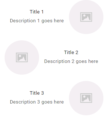
An informational layout section that displays a three-column grid on desktop and switches to an alternating row layout on mobile. It features circular imagery with corresponding titles and descriptions, using CSS flexbox for structural alignment.
- Alternating row layout on mobile (row-reverse)
- Circular image styling with object-fit cover
- Responsive flexbox grid with max-width containment
- Mobile-optimized stacked layout with centered text content
- Highlighting brand values or key product benefits on the homepage.
- Creating an 'Our Process' section with step-by-step visuals.
- Displaying shipping, returns, and support icons with descriptions.
- Most Shopify themes
- Shopify Online Store 2.0
The code
1<!DOCTYPE html>2<html lang="en">3<head>4 <meta charset="UTF-8">5 <meta name="viewport" content="width=device-width, initial-scale=1.0">6 <style>7 .flex-container {8 display: flex;9 flex-wrap: wrap;10 justify-content: center;11 }1213 .item-box {14 margin: 10px;15 text-align: center;1617 }1819 .item-box img {20 width: 30%;21border-radius: 50%;22object-fit: cover;23 }2425 .item-title {26 margin: 5px 0;27 }2829 .item-description {30 margin: 5px 0;31 }323334 @media (min-width: 768px) {35 .item-box {36 flex: 0 0 30%;37 }38 .item-box img {39 width: 30%;40margin-bottom: 15px;41min-width: 150px;42 }43 .flex-container{44 display: flex;45 flex-wrap: wrap;46 max-width: 1000px;47 align-content: center;48 }49}505152 @media (max-width: 767px) {53 .flex-container {54 flex-direction: column;55 }56 .item-box img {57 width: 32%!important;58 }5960 .item-box {61 display: flex;62 flex-direction: row;63 align-items: center;64 justify-content: center;65 flex-wrap: wrap;66 }6768 .item-box:nth-child(odd) {69 flex-direction: row-reverse;70 }7172 .item-box img, .item-box .text-content {73 width: 60%;74 }75 }767778 </style>79</head>80<body>8182<div class="container" style = "justify-content: center; display: flex;">83 <div class="flex-container" style="padding: 30px 0px 30px 0px;">84 <div class="item-box">85 <img src="https://encrypted-tbn0.gstatic.com/images?q=tbn:ANd9GcQQOuXSNhx4c8pKvcysPWidz4NibDU-xLeaJw&s" alt="Image 1">86 <div class="text-content">87 <h4 class="item-title">Title 1</h4>88 <p class="item-description">Description 1 goes here</p>89 </div>90 </div>91 <div class="item-box">92 <img src="https://encrypted-tbn0.gstatic.com/images?q=tbn:ANd9GcQQOuXSNhx4c8pKvcysPWidz4NibDU-xLeaJw&s" alt="Image 2">93 <div class="text-content">94 <h4 class="item-title">Title 2</h4>95 <p class="item-description">Description 2 goes here</p>96 </div> </div>97 <div class="item-box">98 <img src="https://encrypted-tbn0.gstatic.com/images?q=tbn:ANd9GcQQOuXSNhx4c8pKvcysPWidz4NibDU-xLeaJw&s" alt="Image 3">99 <div class="text-content">100 <h4 class="item-title">Title 3</h4>101 <p class="item-description">Description 3 goes here</p>102 </div>103 </div>104 </div>105</div>106107</body>108</html>
How to install Info Section with images v2 on your Shopify theme
This snippet belongs in sections/main-product.liquid (or any section where you want it to appear), in the block of your template where it makes the most contextual sense. Expect the whole job to take about 5–10 minutes.
- 1From your Shopify admin, open Online Store → Themes, click the … button on your live theme and choose Duplicate. Always work on a copy so you can roll back instantly.
- 2On the duplicated theme, click … → Edit code to open the theme code editor.
- 3Open sections/main-product.liquid (or any section where you want it to appear) in the file tree. If your theme uses different file names, search for the template that renders the area where you want the block to show up.
- 4Click Copy code on this page, then paste the snippet in the block of your template where it makes the most contextual sense.
- 5The snippet ships with its own scoped
<style>block, so you do not need to touchbase.cssortheme.css. If you prefer to keep CSS centralised, move the contents of the style tag into your theme stylesheet and delete the inline block. - 6Click Save, then hit Preview and check the block on desktop, tablet and mobile widths.
- 7When you are happy with the result, publish the duplicated theme from Online Store → Themes → Actions → Publish.
How to customise it
Every value below lives inside the snippet, so you can adapt Info Section with images v2 to your brand without touching the rest of the theme.
- Corners —
border-radius: 50%controls the roundness. Set it to 0 for a sharper editorial look, or increase it for a softer, app-like feel. - Images — replace the placeholder image URLs with your own assets. Upload them under Content → Files in Shopify admin and use the generated CDN URL, or reference a theme asset with
{{ 'my-image.png' | asset_url }}. - Copy — rewrite the hard-coded text (for example “Title 1”) in your own brand voice, and translate it if you sell in more than one language.
- Responsive behaviour — the
@mediaquery defines the mobile breakpoint. Adjust the pixel value if your theme uses a different breakpoint scale.
Common mistakes to avoid
These are the issues merchants run into most often when installing a snippet like this one.
- Editing the live theme directly. Duplicate it first — a single unbalanced Liquid tag can take a storefront down mid-campaign.
- Pasting the code into the wrong file. Dropped into
layout/theme.liquidinstead ofsections/main-product.liquid, this block will render on every page of the store, including ones where it makes no sense. - Renaming the CSS classes in the markup but not in the style block, or vice versa. The class names have to match exactly or the styling silently disappears.
- Leaving the demo images in place. They are hosted on third-party domains, can disappear at any time and slow the page down. Re-upload them to Shopify Files before going live.
- Publishing without testing on a real phone. Most Shopify traffic is mobile, and layout problems almost always surface there first.
Performance notes
What this block costs you in load time, and how to keep that cost at zero.
- The CSS is inline and scoped to this block, so it adds no extra network request. At a few kilobytes it has no measurable effect on your Lighthouse score.
- Add
loading="lazy"plus explicit width and height attributes to every image in the snippet. That prevents Cumulative Layout Shift, which is a Core Web Vitals ranking factor. - Third-party image URLs bypass the Shopify CDN and add extra DNS lookups. Self-hosting those assets usually saves 100–300ms on first paint.
- Run PageSpeed Insights before and after you add the block so you have a concrete number rather than a guess.
SEO & accessibility
How to add this block without damaging your on-page structure or your rich results.
- Nothing in this snippet should replace your page
<h1>. Keep product and page headings intact and use<h2>or<h3>for the block's own heading so the document outline stays clean. - Write a descriptive alt attribute for every image. Empty or generic alt text is one of the most common accessibility and SEO issues on Shopify stores.
- If the block shows review or rating content, keep it consistent with the structured data your review app already outputs. Duplicating or contradicting rating markup can cost you the rich result entirely.
- The block does not create a new URL, so there is no canonical or indexing change to make. It improves on-page engagement signals rather than crawlability.
Info Section with images v2 — questions merchants ask
Will this snippet work with my theme?
It is built with standard Liquid, HTML and CSS, so it works with Dawn and virtually every Online Store 2.0 theme, as well as most vintage themes. The only thing that changes between themes is the file you paste it into — if yours has no sections/main-product.liquid, look for the equivalent template that renders the same area.
Do I need an app to use it?
No. This is theme code you own outright: no monthly fee, no third-party script tag, and no app that can break your storefront the next time it updates.
How long does it take to add “Info Section with images v2” to a store?
Most merchants have it live in under fifteen minutes — duplicate the theme, paste the code, adjust the colours and copy, preview on mobile, publish.
The styling looks broken after pasting. How do I fix it?
Confirm you copied the whole snippet including the closing style tag, then check whether one of your theme's own CSS rules is overriding it. If a theme rule wins, increase the specificity of the snippet's selector rather than scattering !important through the file.
Will it slow my store down?
Not meaningfully. It is inline markup with scoped CSS and at most a few lines of vanilla JavaScript — no external libraries, no extra HTTP request. Optimising your product images will always have a far bigger impact on load time.
Can I use it on a client store or a commercial project?
Yes. Every snippet in the MCO Hub library is free to copy, modify and ship on any store, including client work. Attribution is appreciated but not required.
Related snippets

Keep exploring
Shopify Liquid
Deals & Discounts